Design is not just what it looks like and feels like. Design is how it works. – Steve Jobs
The tricky thing about good design is that it often goes unnoticed – it’s only when design doesn’t work out that it catches our attention.

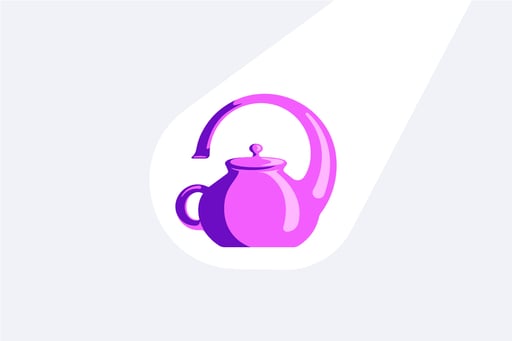
Take for example the illustration of the teapot above. While its design is certainly unique and eye-catching, you can expect the experience of pouring hot tea to be painfully flawed (pun fully intended).
And if you get burned once, you’ll likely not want to use this teapot again – at least not for pouring tea. Instead, it might take on a new purpose of sitting on a shelf as a piece of art, a conversation starter. But that’s where the utility ends.
Far from its common application, design doesn’t just encapsulate the appearances of objects–it’s about their functionality too. But when something just works, it’s taken for granted. Especially for objects with seemingly simple functions, like a chair.
We don’t normally think about whether or not the chair is working, nor the thought that went into making sure that the chair would be able to hold us up, while also being comfortable, and looking good in our living room.
So if you’re reading this, my hope is that you walk away knowing just how important design is, especially for tools with complicated jobs, like what I spend all my days thinking about: enterprise software.
The cost(s) of bad design
At any point in time, more than 25% of enterprise software is going completely unused. It’s actually so bad that someone came up with the term shelfware (remember our impressive but useless teapot?)
Now, this represents an extra cost in itself: your business is paying for something that isn’t being used.
But you also have to consider the purpose of the software. What was its intended use? Which processes was it purchased to simplify, to improve?
If it isn’t solving the intended problems, then it’s likely creating costs in other areas too.
Whether that’s slowing down projects, hampering productivity, or simply adding to the everyday stressors at work, subpar design will come with a cost. Or several.
But what separates bad design from good design, if good design is harder to spot?
To answer that question, I’ll reference one of my favorite design minds, Dieter Rams. An iconic industrial designer, he outlined 10 principles of what makes for good design. In other words, the 10 commandments of good design.
-
Good design is innovative
- Good design makes a product useful
- Good design is aesthetic
- Good design makes a product understandable
- Good design is unobtrusive
- Good design is honest
- Good design is long-lasting
- Good design is thorough down to the last detail
- Good design is environmentally-friendly
- Good design is as little design as possible
For the purposes of this article, I’ll do my best to turn them into concrete criteria that apply to enterprise software.
3 common design pitfalls of enterprise software
Common pitfall #1: bloated platforms
It’s tempting to think that more features = a better product, especially when it comes to software. And in some cases, that can be true – if you’re aiming for a generalist solution like SharePoint or Google Workspace. But as the number of features increases, the quality of those features doesn’t always follow.
Consider a Swiss Army knife – there are a lot of situations where one comes in handy. Need to open a can or a bottle? Not a problem. Cut the price tags off a new shirt? Easy.
Prepare a gourmet meal that requires a lot of vegetable chopping? Well, you can probably get the job done, but it’s likely to be inefficient and take a while.
There’s a reason that you don’t tend to think of a Swiss Army knife as a kitchen staple. Or that you don’t see Gordon Ramsey showcasing them in his kitchens.
It’s because there are other knives that are much more effective for chopping veggies or slicing bread. Knives whose purposes are focused on accomplishing specific tasks extremely well.
The same principle holds true for software; you want a tool that is clear in its purpose, that is truly useful to you in your daily work.
Common pitfall #2: platforms that need manuals
This one builds on the previous point – the more features, the more you’re going to have to read up on where everything is and how to actually use the tool.
Now maybe that’s something you actually really enjoy – you jump at every opportunity you can to sit back, relax, and read up on that new enterprise software your company just purchased. If that sounds like you, then more power to you.
However, many of us either don’t have the time or the passion to read enterprise software manuals.
Perhaps at one point in time, we saw it as a necessary evil, but the way that technology has transformed dramatically over the last few decades has largely shifted our expectations.
Think about some of the platforms that many of us use in our daily lives, like Spotify, Netflix, or Slack. When you first started using one of these services, did you have to look for instructions on how to play a song, find a movie to stream, or send a message?
Chances are, you just logged in and were able to instinctively figure out what to do, with minimal time and effort. That, my friends, is the result of great design. And it also has to do with the intention behind these products – that they were designed for essentially anyone to be able to use easily.
If you contrast that with Microsoft Excel, however, it’s a different story. There’s a reason that most universities still offer entire courses focused on how to use Excel. And while it’s a great tool for a lot of things, it’s one that is often seen as being inaccessible to those who aren’t trained in how to use it.
This isn’t a problem in itself -- it only becomes a challenge if you want a lot of people in the company to use the tool regularly and effectively.
But the expectation that it will be both 1) useful and 2) used by many often accompanies enterprise software, particularly one intended for a purpose like knowledge management.
Common pitfall #3: platforms that leave you feeling meh
So now that we’ve addressed the importance of functionality and simplicity, I want to address one more thing: emotion.
It might seem silly to ask the question, How does this software make me feel?, but I can assure you that it is an important one.
Because the way that we feel about a software (or anything for that matter) largely influences how we approach it and how effective we are in using it.
Think about it this way – how many times have you put off doing something because you didn’t want to do it? Even those of us who do our best to eat the frog have found ourselves here at least once.
We approach things very differently when we have to do them but don’t want to do them. And vice versa. You see, having fun is intrinsically motivated. No one needs to tell us to do it–we’re inspired to take action ourselves. It also helps us to tap into a sense of curiosity, and thus helps us to learn more effectively.
I know that it’s uncommon to pair the words fun and enterprise software together, but hear me out:
How would your daily work change if enterprise software was fun to use?
How would you feel if staying up-to-date on the latest consumer insights was as fun as picking your dinner party playlist on Spotify?
Perhaps you’d feel more inspired, perhaps more productive. Ideally, a bit of both.
These individual outcomes have a powerful impact on the organizational outcomes. Change management becomes easier, adoption is higher, and you get the most value from your software investment.
Simply put, having fun in business is no funny business. And it should be the norm.
Make design a top priority when choosing enterprise software
By now you probably have a pretty solid understanding of why design is important and what aspects are important to pay attention to in enterprise software.
The bottom line is this – from usage, comes value. And the best way to ensure usage is through great design. For knowledge management platforms or any other enterprise software.
When evaluating different solutions, design should be at the top of your list. You might have found the most technologically advanced solution for your company’s problem, but bad design will keep you from reaping those benefits.
Though exact criteria will differ from solution to solution, in general you should look for:
- Platforms with a clear purpose
- Platforms that are intuitive
- Platforms that leave you feeling wow
Of course, you should always look into what actual users say, from their day-to-day experiences with the platform itself to the overarching impact it has had on helping them to achieve their business goals.
Because at the end of the day, the best designs are loved by the people who use them.
And that’s what matters most.


.jpg)

